Whether familiar and long-established or decorative and experimental, typographical treasures are bound to be discovered across a wide range of rare book materials. A great place to start exploring and identifying printed typefaces as well as potentially gain some insight into their design and manufacture is through type specimens. What follows will serve as a brief introduction to type specimens as a genre and demonstrate their research value through two examples from the Fisher Library collections.
The rare book genre of type specimens encompasses any printed matter which is designed to display the full range of fonts and, in some cases, decorative elements such as ornaments, borders, rules and illustrative blocks available from a particular type foundry or printer. The original purpose of this genre was primarily commercial. Type specimens were traditionally issued by type foundries (producers and suppliers of type) to attract their customers: printers. In turn, printers often produced their own specimens to display and document the range of fonts within their holdings, whether for private or commercial reference. This genre dates back to the early sixteenth century, following the introduction of and demand for moveable type in Europe in the mid-fifteenth century.
Early specimens were printed on broadsides: large single-sided sheets distributed by type founders which could be posted to walls or folded and laid into books. While type specimens continued to manifest in these ephemeral formats, they also came to be issued as pamphlets and more formal bound volumes or catalogs, especially around the nineteenth century in Europe and North America. With the introduction of mechanized typefounding and printing in the nineteenth century, type specimens helped to spread an explosion of new and experimental typefaces. These innovations in type design included bolder display and decorative types and the introduction of alternative text types such as sans serifs.
The fonts sampled in type specimens are usually presented in a range of sizes and arranged into sentences, as opposed to complete alphabetical sets, in order to demonstrate their intended use and reading experience. Following the practices and tastes of early type founders and printers, a longstanding tradition was to source sample texts for Roman typefaces from familiar Latin classical passages, such as Cicero’s "Oration against Catiline." Over time, scholars like Belgian Librarian and Book Historian Hendrik D. L. Vervliet have dismissed the literary content of type specimens, maintaining that "the text is of no importance in itself; it serves only to display the types." More recently, in his book Alphabets to Order (2000), Alastair Johnston calls for renewed attention to the literary content of type founders’ specimens, defending the sample texts as deliberate choices of type founders and printers that carry invaluable insight into print history and culture.
Even today with the dominance of digital typesetting and design, the tradition of issuing type specimens carries on, usually in electronic forms, though some are still accompanied by printed matter. For the bibliographer, type specimens, whether historical or born-digital, serve as a window into the evolution of graphic design practices, tastes and reading cultures across time and place.
Let's take a look at two examples of type specimens from the Fisher Library collections:
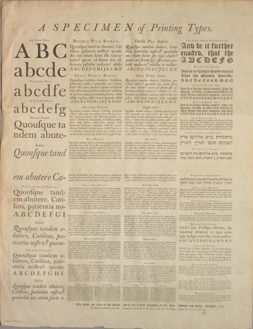
 1) Alexander Wilson and Sons. A specimen of printing types. Glasgow: The above are some of the sizes cast in the Letter Foundery of Dr. Alex. Wilson and Sons, 1783. [Call number: duff pam ff 00011]
This late eighteenth-century type specimen is an example of a broadside issued by one of Scotland’s first and most prominent type founders, Dr. Alexander Wilson (1714-1786). Wilson was a professor of Astronomy known for producing type for the Foulis Press at the University of Glasgow. Issued in the late eighteenth century, each letter displayed on this sheet would have been cast, typeset and printed by hand.
The sheet is arranged in four columns and displays 45 labelled fonts in a variety of sizes and styles, including a small selection of Hebrew and Greek typefaces. In keeping with the genre’s tradition of sampling Latin classical quotations, the Roman fonts on this type specimen are each displayed with the same opening quotation from Cicero’s “Oration against Catiline.” This particular Ciceronian passage, which would have been familiar as a speech memorized in schools, came to be the dominant sample text among type founders and printers following its use on the specimen sheets of leading and influential English type founder William Caslon in 1734. Each of the Roman fonts displayed on this sheet also feature an alphabetical sample of its upper-case letters in a single line. The sample text for the Greek fonts likewise evokes classical works, quoting from Demosthenes’ “Orations 8. On the Chersonese.” As for the Hebrew fonts, the sample text is biblical, quoting the opening lines of the Torah (Old Testament, Genesis Chapter 1). We need not be too quick to dismiss the sample texts as irrelevant to the function of this type specimen. While the viewer’s attention is certainly called to consider the style of the letterforms themselves, the source text also plays an important function in fostering familiarity and resonance with different target audiences or potential customers. Each sample text also represents a choice on the part of type founders and/or printers which offers us insight into their literary tastes.
This broadside is also an example of one that was designed to be folded and laid into a book, as indicated by the binding instructions at the foot of the sheet which read, “The Binder is desired to place this Broadside in the middle of the Sheet 13A, Vol. III., facing Article ‘Printing, method of.’” As indicated in this item’s catalogue record, this sheet was designed for and extracted from the third volume of Ephraim Chambers’ Cyclopaedia (London: 1786).
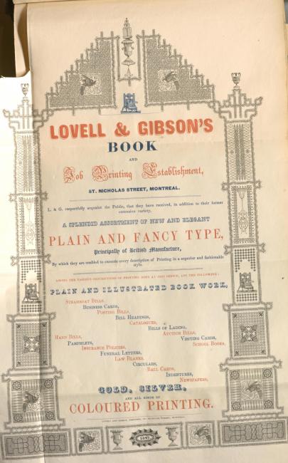
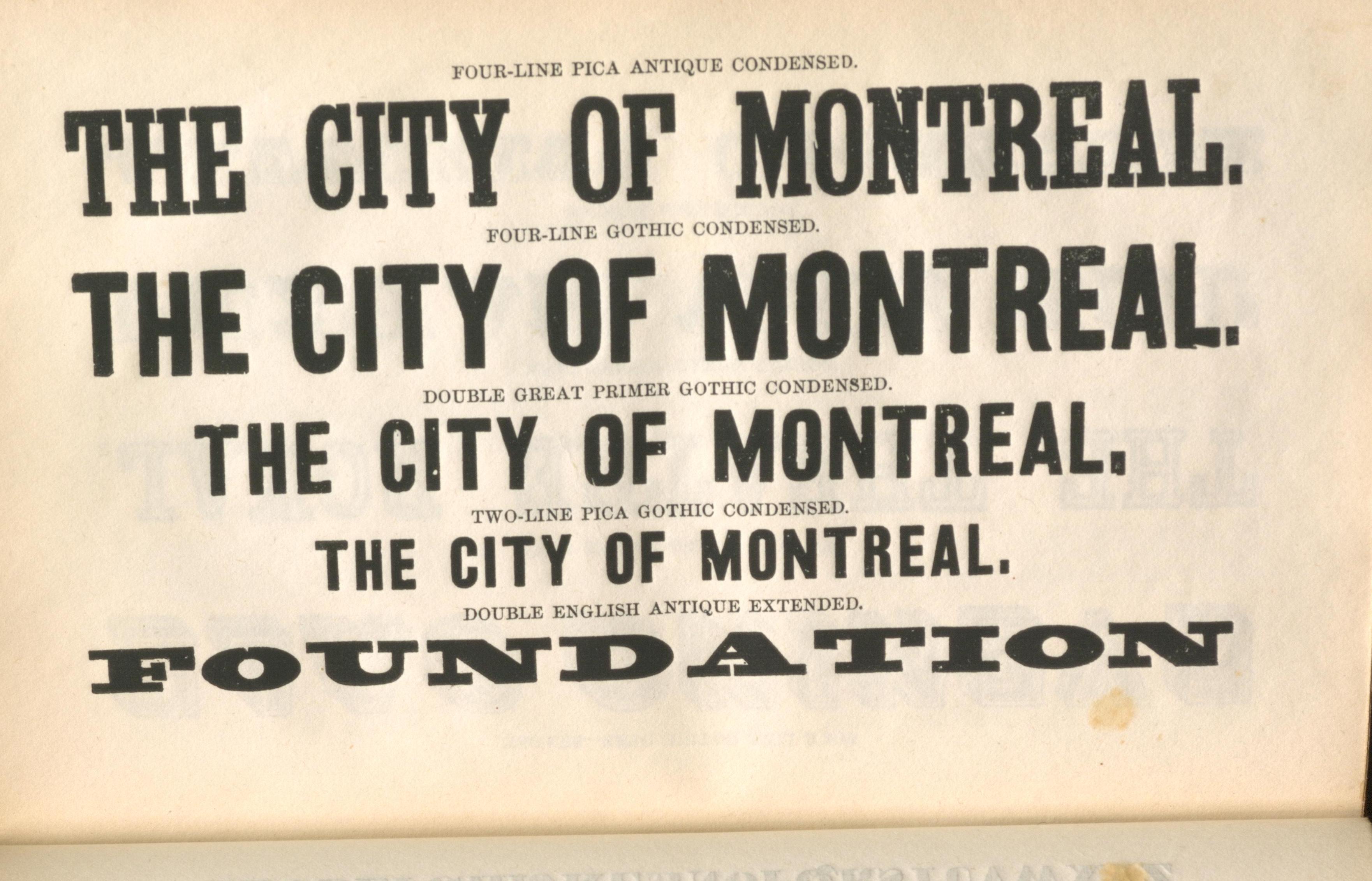
 2) Lovell and Gibson. Specimen of printing types and ornaments, in use at the printing office of Lovell & Gibson, St. Nicholas Street, Montreal. Montreal: Printed by Lovell and Gibson, 1846-1847. [Call number: duff 00603].
As suggested by its title, this specimen book was issued by a printer rather than a type founder and therefore serves a slightly different function in documenting and advertising the fonts, ornaments and illustrative blocks in use at the printing house of the nineteenth-century Canadian printers Lovell & Gibson. In his introduction to the Bibliographical Society of Canada’s (BSC) 1975 facsimile of this historic type specimen, Canadian poet and then-President of the BSC, Douglas Lochhead (1922-2011) describes Lovell & Gibson as Canada’s then “most prolific printer-publisher” and this particular volume as the earliest known type specimen book printed in Canada. By the time this specimen book was published, John Lovell (1810-1893) had been in business as an independent printer in Montreal for over ten years and in partnership with his brother-in-law John Gibson since 1842. Using both hand- and steam-powered presses, Lovell & Gibson printed a wide range of materials in both English and French including newspapers, periodicals, government documents, maps, sheet music, some of the first Canadian textbooks and the first Montreal City Directories.
This specimen book begins with a section displaying the wide variety of Roman text types in use by Lovell & Gibson. Each font is displayed using an English sample text in both regular and italic styles, accompanied by a single line of its upper-case letters sampled alphabetically and a sample of its numerical characters. The text type is followed by specimens of display type (decorative/bolder typefaces), ornaments and some illustrative blocks and engravings in the firm’s possession. The volume also includes a fold-out advertisement for Lovell & Gibson boasting their “splendid assortment of new and elegant plain and fancy type, principally of British manufacture,” the broad range of printing jobs they accommodated and their “gold, silver and all kinds of coloured printing.” The playful layout of this fold-out further emphasizes Lovell & Gibson’s versatility and craftsmanship. Not only does this specimen book serve as a testament to the nineteenth-century’s boom in typographic design, but it also offers rich insight into the operations of a historic Canadian printing house and the readers and audiences they were devoted to serve.
- Leora Bromberg, Master of Information and Master of Museum Studies Candidate, Faculty of Information
Sources
Berger, Sidney E. The Dictionary of the Book: A Glossary for Book Collectors, Booksellers, Librarians, and Others. Lanham, Boulder, New York and London: Rowman & Littlefield, 2016.
Calderisi Bryce, Maria. “John Lovell (1810-93): Montreal music printer and publisher” in Musical Canada: Words and music honouring Helmut Kallmann, edited by John Beckwith and Frederick A. Hall, 79-96. Toronto: University of Toronto Press, 1988.
Carter, John. ABC for Book Collectors. New Castle, DE: Oak Knoll Press, 2016. https://ilab.org/articles/john-carter-abc-book-collectors
Demosthenes. “Orations 8. On the Chersonese” in Orations, Volume I: Oration 1-17 and 20. Translated by J. H. Vince. Cambridge, MA: Harvard University Press, 1930.
Johnston, Alastair. Alphabets to Order: The Literature of Nineteenth-Century Typefounders’ Specimens. New Castle, DE: Oak Knoll Press, 2000.
Killick, Tim. “Type Specimen Book” in Oxford Companion to the Book edited by Michael F. Suarez, S.J. and H.R. Woudhuysen. Oxford: Oxford University Press, 2010.
Lochhead, Douglas. “Introduction” in Specimen of printing type and ornaments in use at the printing office of Lovell & Gibson, St. Nicholas Street, Montreal by the Bibliographical Society of Canada, Facsimile Series no. 9, 1-7. Toronto: University of Toronto Press, 1975.
Raven, James. “Why Ephemera were not Ephemeral: The Effectiveness of Innovative Print in the Eighteenth Century.” The Yearbook of English Studies 45 (2015): 56-73.
